VOICE OUT! Training & Empowering Youth to Become Citizen Data-Journalists

Graphic Resistance: Telling Data Stories with Images
Visualizing big data sets with easy-to-read illustrations can help tell a story and make complex data easier to understand by more people.
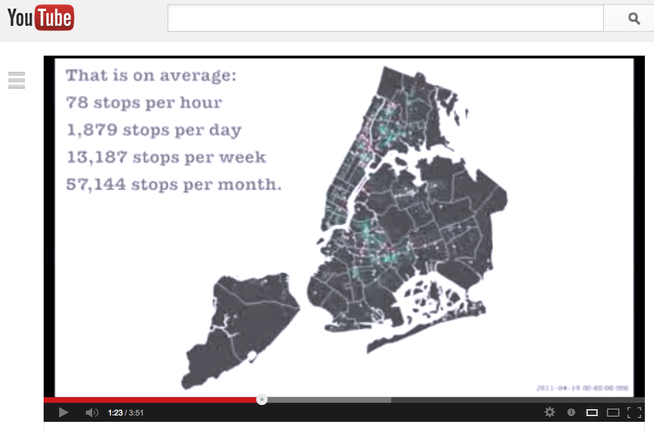
There are a range of visualizations of big data sets that may prove effective. One example is the interactive map above (still image shown) created by the Morris Justice Project.
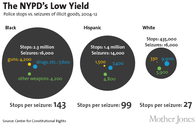
Or, it could be as simple as a series of circles and dots, like these from Mother Jones magazine and the Center for Constitutional Rights:
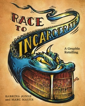
Visualizing big data sets could also mean creating a graphic novel, like this one created by Sabrina Jones based on an earlier academic text, chock-full of statistics:
A series of workshops will help young people create their own data visualizations in order to tell their own stories.